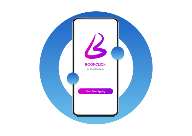
About BookClick
UX Research / Strategy / UX/UI Design
User-Friendly Museum App for Easy Ticket Booking and Art Discovery
The product is a mobile app for discovering and booking museum tickets, offering clear details like prices, images, and reviews. It’s designed for all users, allowing guest bookings without sign-up for easy access to cultural events.
roject Duration: July 2024 to November 2024
Project Overview
As the Lead UX Designer and Researcher, I led the end-to-end design process for the BookClick app. My responsibilities included conducting user research, identifying pain points, and designing intuitive, user-centered interfaces. I created prototypes, tested design solutions, and iterated based on feedback to ensure a seamless guest booking experience.
Project Overview
This project aims to simplify the exhibition discovery and booking process by removing unnecessary friction. It delivers a user-friendly experience with upfront access to prices, visuals, and reviews—no account needed. The result is a more intuitive, accessible platform that enables users to confidently explore and plan their museum visits.
Project Overview
As the Lead UX Designer and Researcher, I led the end-to-end design process for the BookClick app. My responsibilities included conducting user research, identifying pain points, and designing intuitive, user-centered interfaces. I created prototypes, tested design solutions, and iterated based on feedback to ensure a seamless guest booking experience.
Project Overview
I conducted user interviews and surveys to uncover pain points and user behavior patterns. I developed personas and mapped key user journeys to guide the design process. My work included creating wireframes and high-fidelity prototypes, with a strong focus on accessibility and clarity. I streamlined the guest booking flow, ran usability tests, and continuously refined the design based on real user input to align with both user needs and project objectives.
Users were discouraged by the need to create an account before viewing essential exhibition details such as pricing, descriptions, and images.
Many users had trouble finding ticket prices quickly, which led to hesitation and a lack of trust in the booking process.
There was a strong desire for flexibility—users wanted to explore and book events without being forced to register, especially when making spontaneous decisions.
Users were confused by repetitive content and unclear categorization, which made it difficult to understand whether the app featured multiple exhibitions or just a single one.
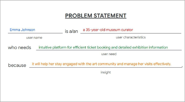
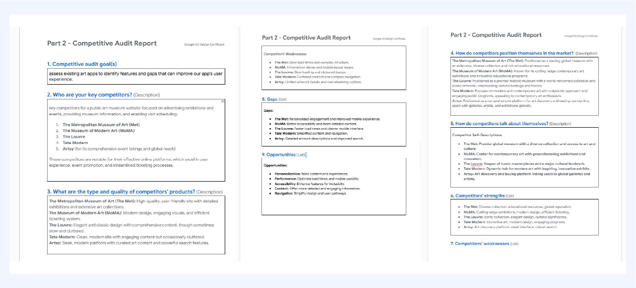
Problem statement:
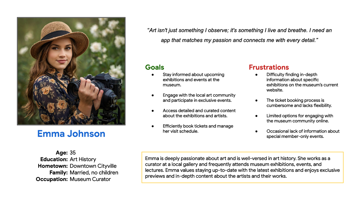
Art enthusiasts and museum curators often struggle with accessing detailed, up-to-date exhibition information and face inefficient ticket booking processes. These challenges hinder their ability to stay connected with the art community and plan museum visits effectively.

User Journey Map:
The user journey mapping flow for Emma Johnson, details her steps from discovering exhibitions to booking tickets and managing her visit. It highlights her interactions, emotional responses, and opportunities for optimizing the website experience, ensuring she can efficiently and enjoyably engage with the museum’s offerings.
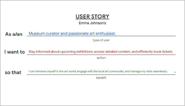
User Story:
As a: Museum curator and passionate art enthusiast. I want to: Stay informed about upcoming exhibitions, access detailed content, and efficiently book tickets. So that: I can immerse myself in the art world, engage with the local art community, and manage my visits seamlessly.
Define Phase
This problem statement was crafted by identifying Emma Johnson's specific characteristics as a museum curator and art enthusiast. The statement highlights her need for a platform that provides timely and detailed information about exhibitions, simplifies the booking process, and enhances her connection to the art community. The insight was derived from the gap in current platforms, which fail to meet her expectations for content depth and ease of use. This statement clearly defines Emma’s challenges, which guided the design of a more user-centered solution.
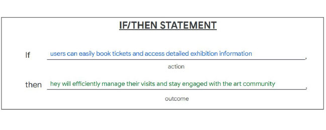
Hypothesis Statement
This hypothesis statement was crafted by focusing on the core user needs identified in the problem statement. It centers around two key actions: providing an easy ticket booking process and offering access to detailed exhibition information. These actions are directly linked to the desired outcome, which is improved user efficiency in managing visits and increased engagement with the art community. By following the "if/then" structure, the statement hypothesizes that simplifying these aspects of the user experience will lead to more satisfied and engaged users. This was based on insights gathered from user research and their frustrations with current platforms.
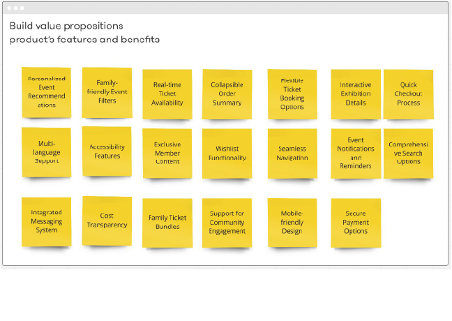
Value proposition
In this image, I’ve organized the key features and benefits of the BookClick app into categories to illustrate how they address user needs and enhance the overall experience. The sticky notes capture various elements, such as Personalized Event Recommendations, which tailor suggestions based on user preferences, and Real-time Ticket Availability, ensuring users can quickly secure tickets for their desired events. Additionally, Family-friendly Event Filters make it easier for users like Maria to find educational activities for her children. Features like Interactive Exhibition Details and Seamless Navigation enhance user engagement and ensure an intuitive experience. The Flexible Ticket Booking Options and Collapsible Order Summary streamline the process, while Mobile-friendly Design and Accessibility Features ensure accessibility and convenience for all users. These features work together to provide a seamless, engaging, and flexible platform that meets the needs of different personas, from art enthusiasts to families.
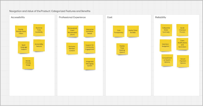
Value proposition
In this slide, I’ve organized the key features and benefits of the BookClick app into four main categories: Engagement and Community, Cost and Flexibility, Accessibility, and Reliability. The process involved carefully aligning each feature with the specific needs and pain points of our target users. For Engagement and Community, features like Personalized Event Recommendations and Support for Community Engagement ensure users feel connected and informed. Cost and Flexibility focuses on providing transparency and affordable options with Family Ticket Bundles and the ability to book as a guest. In Accessibility, features like Multi-language Support and Mobile-friendly Design make the platform inclusive and easy to use across different needs. Finally, Reliability is addressed with features like the Collapsible Order Summary and Quick Checkout Process, ensuring a smooth and efficient user experience. This process not only ensures that the app caters to a wide range of user needs but also emphasizes seamless navigation and functionality throughout the platform.
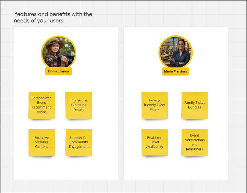
Official Value Proposition
In the final stage, the official value proposition, I matched the key features and benefits of the BookClick app with the specific needs and preferences of my two personas, Maria and Emma. By carefully analyzing their goals and frustrations, I identified which features would most effectively address their pain points. For Maria, a busy mother seeking family-friendly activities, features like Family Ticket Bundles and Real-time Ticket Availability were prioritized to make the booking process smoother and more accessible. For Emma, a passionate art enthusiast, features like Personalized Event Recommendations and Exclusive Member Content were highlighted to ensure she stays connected with the art community. This phase allows me to clearly demonstrate how the app delivers value to each persona, ensuring a tailored and impactful experience for both users.
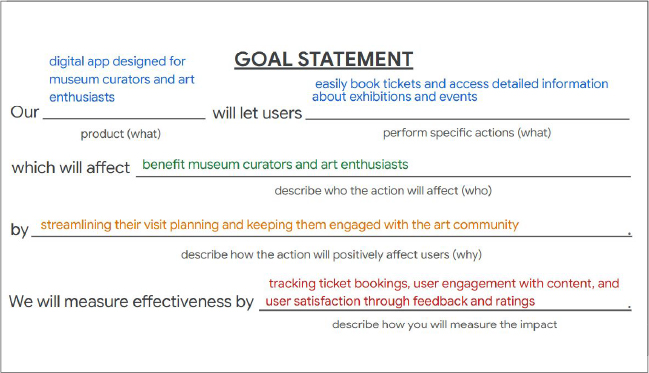
Goal statements
In this phase of the design process, the goal statement was crafted to define the product’s key objectives and the impact it aims to achieve. By clearly identifying the target users—museum curators and art enthusiasts—the goal statement articulates how the app will address their needs: simplifying the ticket booking process and enhancing engagement with exhibitions. This stage involves aligning product features with user benefits and ensuring that measurable outcomes, such as ticket bookings, user engagement, and satisfaction, are tracked. By focusing on these key metrics, the app’s effectiveness can be evaluated and continuously improved to better serve its users.
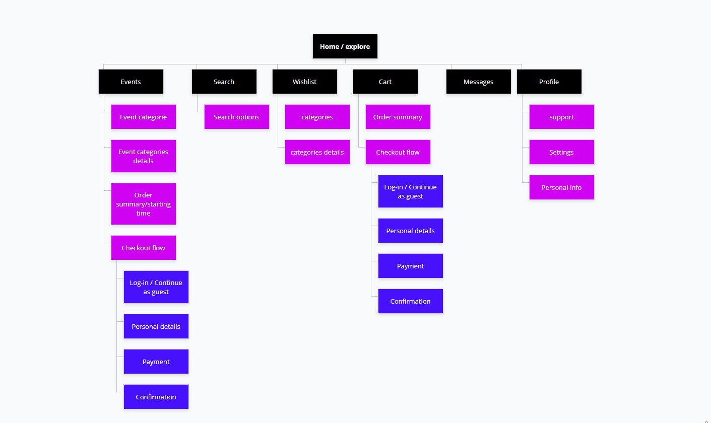
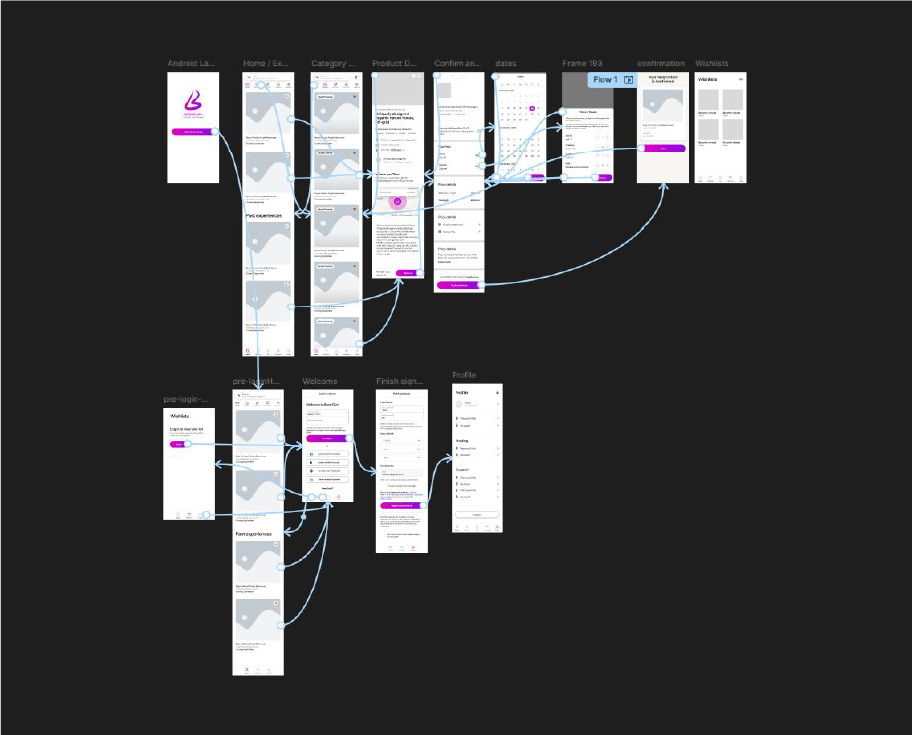
User Flow
The user flow for the museum app was designed to align with the key goal: enabling users to easily explore exhibitions, plan visits, and purchase tickets. Starting with the entry point—opening the app—the flow was mapped out step by step, incorporating primary tasks like navigating the homepage, viewing exhibitions, and completing ticket purchases. Each step was visually represented: circles for user actions (e.g., selecting an exhibition), rectangles for screens (e.g., event details or ticket confirmation pages), and diamonds for decision points (e.g., deciding whether to book tickets or continue browsing). Solid and dotted arrows connected the elements, illustrating user progress and any potential backtracking paths. This structured approach anticipated user needs, minimized friction, and ensured a logical journey from entry to task completion, aligning the app's design with the expectations of museum visitors and enhancing their overall experience.
User Flow link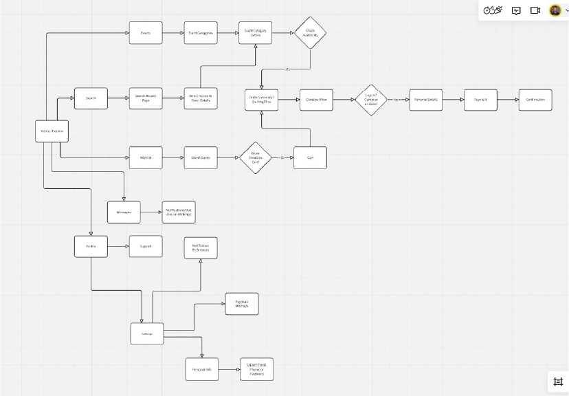
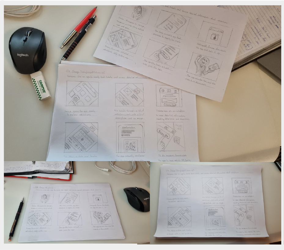
Storyboards
Creating the storyboards for my app involved defining a clear narrative through problem, goal, and scenario statements. The big-picture storyboard highlighted the user’s experience and emotional journey, while the close-up storyboard focused on key interactions and app functionality. Each panel illustrated smooth transitions and solutions to user pain points, ensuring a clear and user-friendly design.
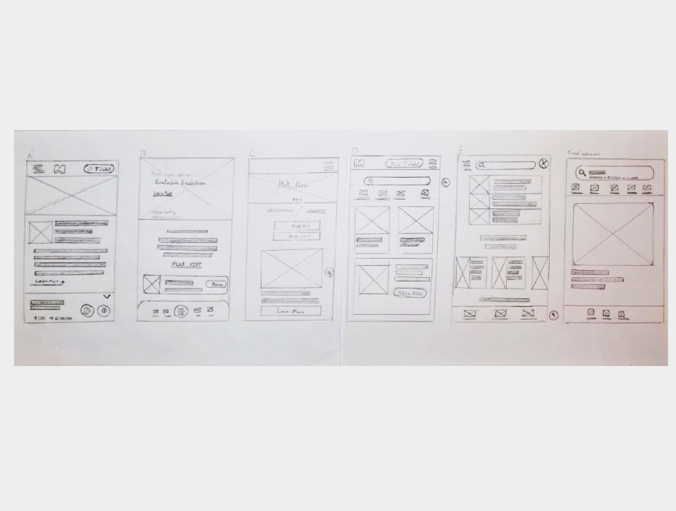
wireframe
Creating paper wireframes involved sketching the basic layout and structure of the app to visualize its functionality and flow. These sketches focused on key screens and elements, such as navigation, buttons, and content placement, ensuring clarity and simplicity. Paper wireframing allowed for quick iterations, enabling the refinement of ideas and addressing potential design issues early in the process. It was an efficient way to brainstorm and establish the app's foundational design before moving to digital prototypes.
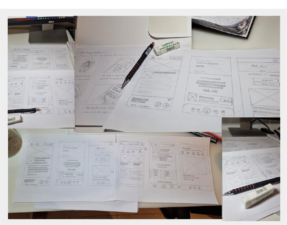
wireframe
The paper wireframes for the museum app aim to optimize content placement and navigation for clarity and usability. They focus on presenting information intuitively while allowing flexibility for future expansions, ensuring a user-friendly experience for easy access to exhibitions, ticketing, and essential features.
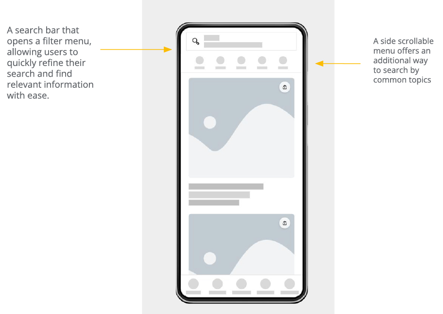
wireframe
The digital wireframe design focused on aligning with users' common expectations of navigation on digital platforms. It aimed to showcase information effectively while minimizing the steps required for users to complete their desired tasks. A top search bar will offer users a quick and efficient way to navigate, guiding them to the optimal results by filtering information based on their input. A side scrollable menu will provide users with an additional way to search by common topics, enhancing navigation and accessibility
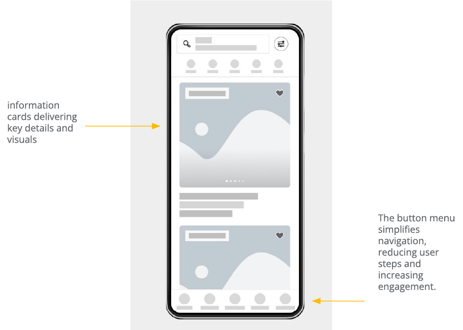
wireframe
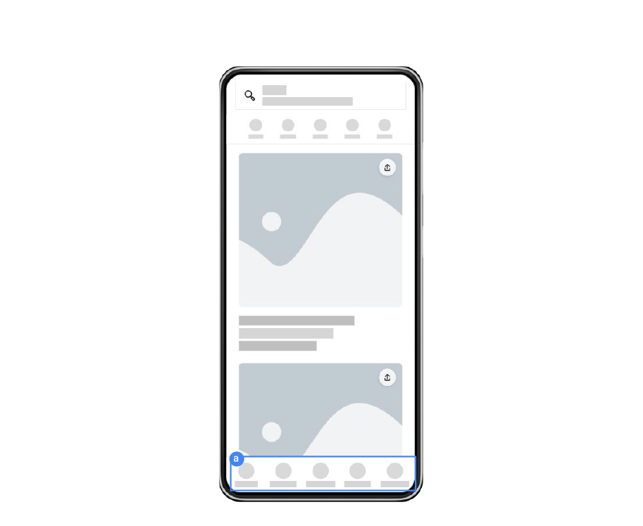
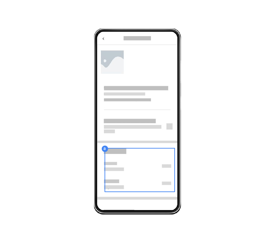
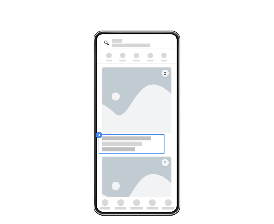
The information cards are designed to be space-efficient, delivering key details and visuals with a slideshow option. Additional features include wishlist functionality and labels for important details like "animal-friendly" or "fully accessible." The button menu simplifies navigation, reducing user steps and increasing engagement.
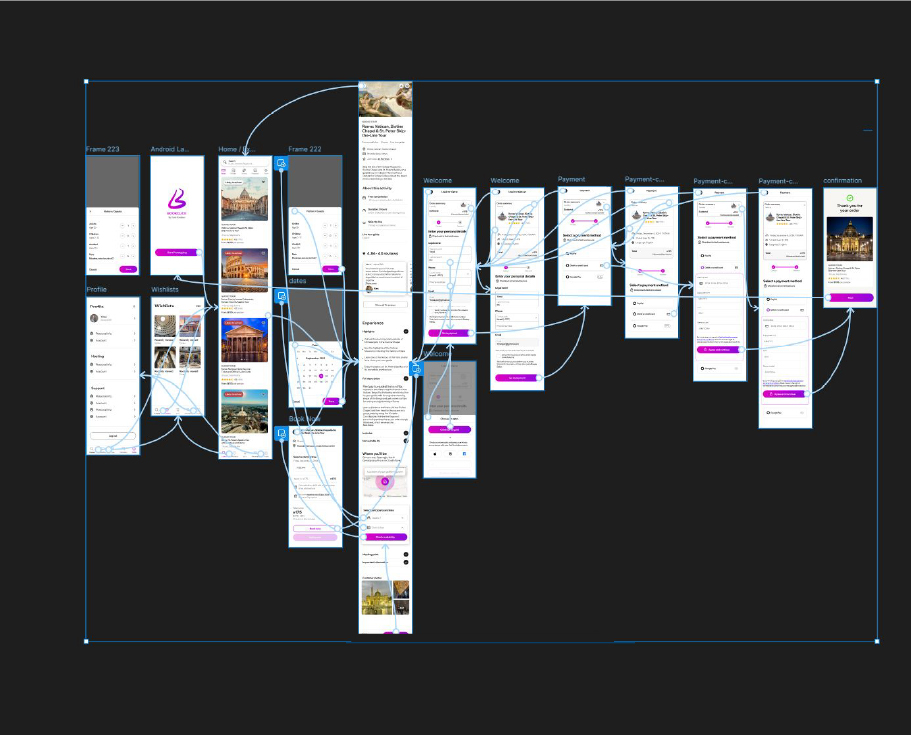
Prototype
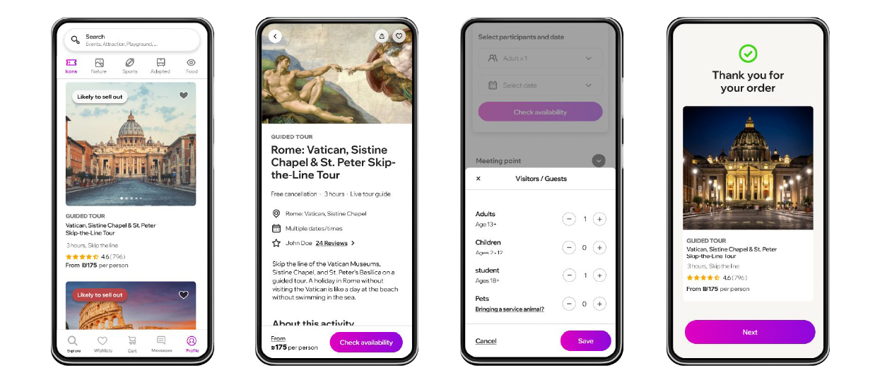
The prototype simulates a museum ticket booking process. Users start at the home page, browse available exhibitions, and select one of interest. They then choose a date, specify ticket types (adult, student, etc.), and proceed to the booking page. Finally, users review their selection, apply discounts if available, and confirm the purchase. The flow ends with a booking confirmation screen displaying essential ticket details.
Usability Study
October 2024
Team UXR: Yossi Povalaev UXD: Yossi Povalaev
Section 1 Study Details Section 2 Themes Section 3 Insights & Recommendations

Study Details
The project aimed to create a user-friendly app for museum visitors to enhance their experience through easy navigation, ticket purchasing, and access to exhibition information. The design process focused on addressing common challenges faced by museum-goers, such as finding exhibit details, understanding museum layouts, and accessing relevant updates. Conducting a usability study helped gather insights on user needs and preferences, enabling the team to refine the app for optimal usability and engagement.
How easily can users navigate the app? Do users find it easy to access exhibit and ticket information? What features do users find most useful or unnecessary? How likely are users to use this app for future visits? Are there areas where users feel improvements are needed?
8 participants The participants varied in age from their early 20s to 40s and had different experiences with museum visits, from frequent to occasional. Most were comfortable with digital platforms, though familiarity with museum apps varied. They prioritized features like exhibition details, ticketing options, and ease of use.
25-minute sessions for each participant US, remote Unmoderated usability study. Users were asked to complete tasks on a low-fidelity prototype.
User Testing
In this video, a participant records himself while completing the prompts from the usability study. He is interacting with the low-fidelity prototype prior to the final design changes. The feedback collected from this and several other user sessions helped shape key improvements through iterative design cycles.
Usability Study
To document insights from my usability testing, I used a structured note-taking spreadsheet that captured each task, the user's click path, key observations, direct quotes, and task completion ratings. This helped me track pain points—like confusion caused by repeated content and the need to sign up before accessing details—and identify patterns across sessions. The template allowed for quick comparison and guided meaningful design improvements through data-driven iterations.
Usability study note-taking spreadsheet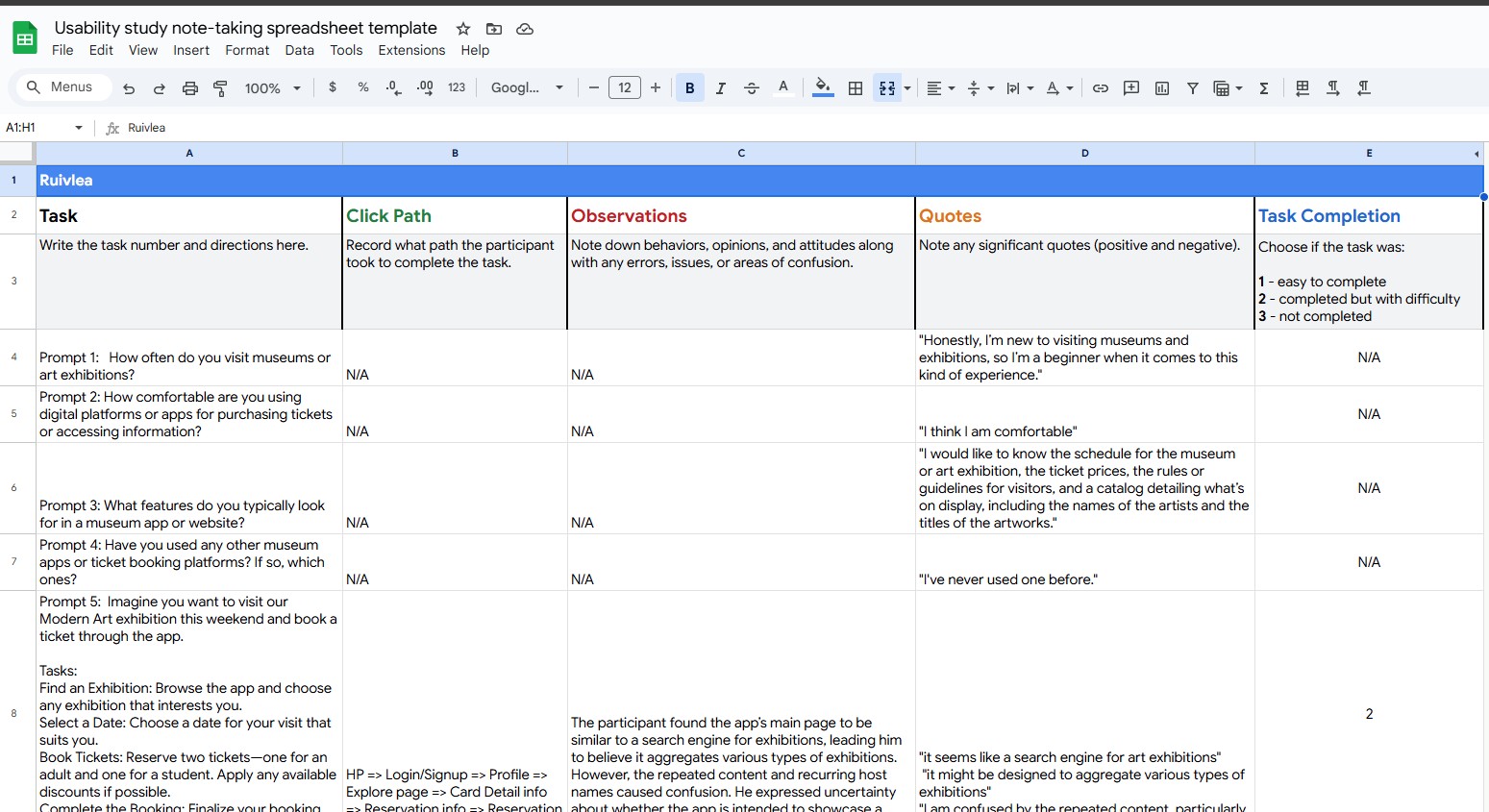
Theme 1
Observation:
5 out of 7 participants struggled with navigation, citing confusing paths and repetitive content.
Insight:
The app's navigation needs simplification and clear pathways to improve user flow.
Theme 2
Observation:
4 out of 7 participants felt frustrated by the sign-up requirement before viewing exhibition details.
Insight:
Implication: Allowing users to view basic exhibition and pricing information before signing up could improve engagement.
Theme 3
Observation:
6 out of 7 participants noted that essential details like schedules and prices were not clearly accessible.
Insight:
Implication: Emphasizing clear, accessible presentation of key details enhances usability.
Theme 4
Observation:
5 out of 7 participants found the design cluttered, which made it hard to focus on key information.
Insight:
A cleaner, streamlined layout can help users navigate and engage more effectively.
Theme 5
Observation:
4 out of 7 participants felt certain features, such as
ticket history and personalized recommendations, did not meet their needs.
Insight:
Aligning features with user expectations could improve satisfaction and engagement.
Theme 6
Observation:
4 out of 7 participants wanted clearer ticket price visibility before booking.
Insight:
Displaying prices prominently prior to the booking process can build trust.
Theme 7
Observation:
3 out of 7 participants expressed interest in a more tailored experience.
Insight:
Adding personalized features, like tailored content and recommendations, can make the app feel more relevant.
Theme 8
Observation:
2 out of 7 participants appreciated the ease of digital tickets and QR code
Insight:
Emphasizing digital ticketing can streamline entry and enhance convenience.
Theme 9
Observation:
3 out of 7 participants desired a more straightforward journey with fewer steps.
Insight:
Reducing clicks and simplifying task flows can enhance efficiency and usability.
Theme 10
Observation:
4 out of 7 participants found inconsistent content and features that caused confusion.
Insight:
Ensuring consistency in content and feature behavior is crucial for a seamless
It was observed that participants struggled with navigation and found the app structure confusing. This theme addresses the core usability and functionality of the app, making it the most pressing issue.
Participants found the design distracting, making it difficult to focus on important content. Streamlining the layout is essential to enhance usability.
Most participants found key information either lacking or hard to access. Prioritizing clarity and ease of access for critical details like schedules and pricing is necessary for a smoother experience.
Participants expressed a desire to see ticket prices clearly before booking, which would build trust and facilitate decision-making.
Participants were frustrated with having to sign up before viewing essential details. Allowing access to exhibition and pricing information before sign-up could improve engagement.
Several participants felt that certain features did not meet their needs, specifically regarding ticket history, search, and recommendations. Ensuring that these features align with user expectations can enhance satisfaction.
Participants noted inconsistencies that led to confusion. Maintaining consistent content presentation and behavior can improve reliability.
Some participants preferred a more straightforward user journey with fewer steps, which would improve efficiency.
A few participants expressed interest in a more personalized experience, such as content recommendations based on preferences. Personalization could increase engagement.
A smaller subset of participants appreciated the convenience of digital tickets and QR codes. Emphasizing this feature can further streamline the entry experience.
Recommendation 1
Recommendation 2
Recommendation 3
Recommendation 4
Recommendation 5
I conducted usability studies on a museum ticket booking prototype to assess how users interact with the platform. The insights gathered will guide future design improvements for a better user experience.
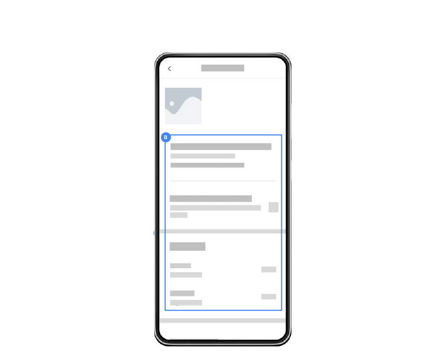
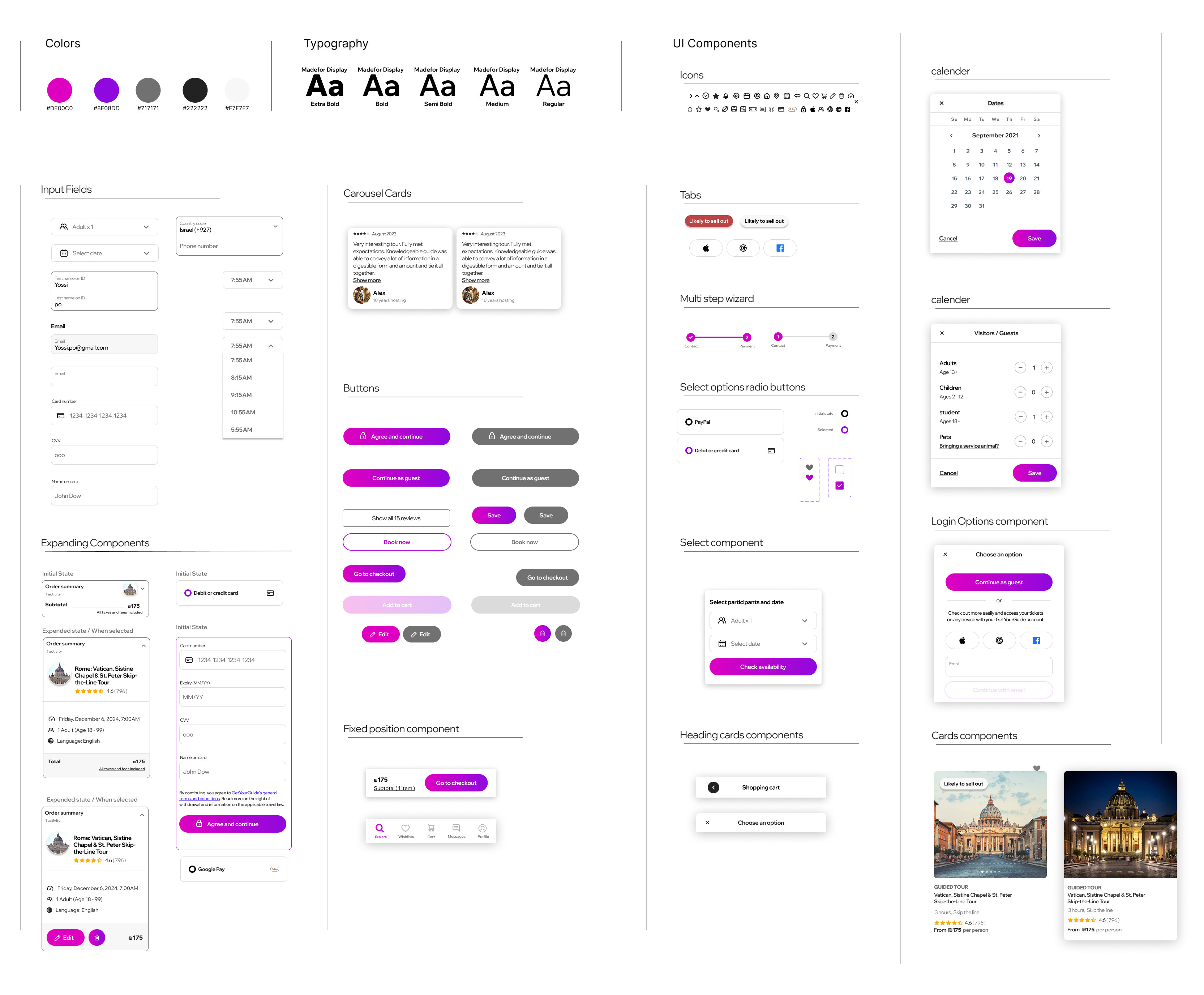
Mockups
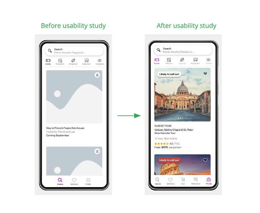
Providing a clear description, price, image, and visitor reviews directly addresses key user pain points and enhances the app's usability by delivering essential information upfront. These changes ensure users see the app's value before signing up, fulfilling their need for detailed exhibition content while improving decision-making. Highlighting ticket prices prominently and adding visuals makes the experience more engaging and reduces navigation issues, while reviews build trust and offer social proof, especially for beginners to museum visits. This streamlined approach aligns with what users look for in a museum app and minimizes confusion, creating a more intuitive and satisfying user journey.
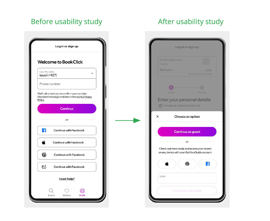
Mockups
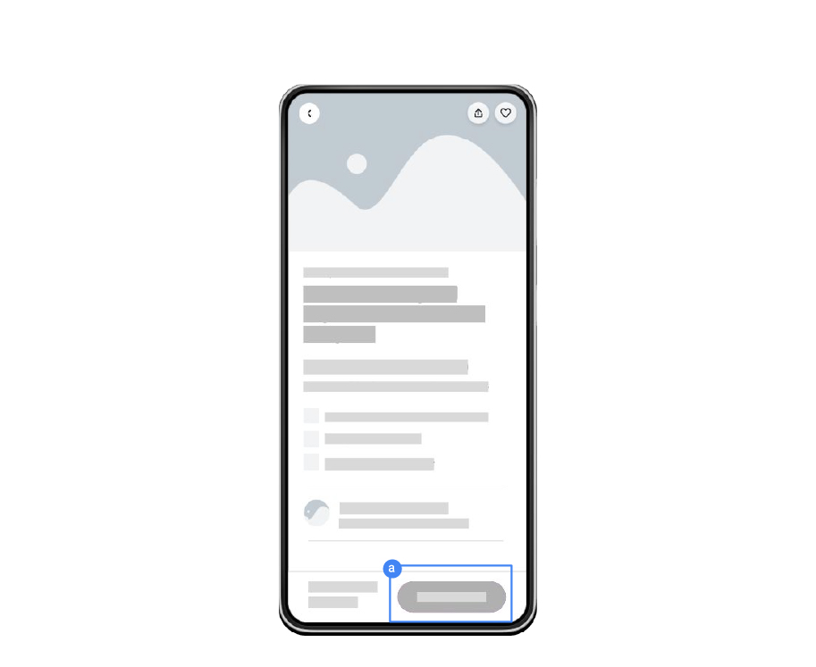
After the usability study, I improved the "Confirm and Pay" flow. Previously, clicking "Confirm and Pay" led users directly to the final booking screen without allowing them to review their details. This caused confusion. After the study, I added an order summary in a collapsible box that is accessible throughout the booking process, allowing users to confirm their details before finalizing the purchase. This change improved transparency and user confidence.

Mockups
One of the most significant problems identified during the usability study was the requirement to sign in before accessing detailed information or booking tickets, which frustrated users and hindered their experience. This issue was resolved by introducing the option to book as a guest, allowing users to explore exhibitions, view details, and complete bookings without needing to sign up. This change ensures a smoother, more user-friendly experience by eliminating unnecessary barriers and providing flexibility for those who prefer not to create an account.
To ensure readability for users with visual impairments, I used adjustable text sizes and high-contrast color schemes for better legibility. This helps users with low vision or color blindness easily navigate and read the content.
I implemented keyboard-friendly navigation across the platform, allowing users to access all interactive elements, like buttons and forms, without a mouse. This ensures that individuals with mobility impairments can easily use the app.
For users with screen readers, I included descriptive alt text for all images and visual elements. This ensures that visually impaired users can understand the content and context of images displayed throughout the platform.
The design improvements significantly enhanced the user experience, making the platform more intuitive and accessible. A study participant mentioned, "The booking process feels much smoother now, and I love that I can review my details before confirming—makes everything feel much more reliable and transparent."
Throughout this project, I learned the importance of user feedback in refining designs and ensuring a seamless experience. I discovered that addressing pain points, such as navigation issues and the need for transparent information, can significantly improve user satisfaction. I also gained valuable insight into accessibility considerations, ensuring that the platform is usable for a wider audience, including those with visual or mobility impairments. Overall, this project deepened my understanding of user-centered design and the iterative process of improving a product.
The next step would be to conduct further user testing with a diverse group of participants to gather more insights and identify any remaining pain points. This will help ensure that the platform meets the needs of all users and refine any areas that may need improvement.
Since many users will likely access the platform on mobile devices, optimizing the app for mobile responsiveness and performance would be a key next step. Ensuring a smooth experience across all devices will help reach a broader audience and improve accessibility.
I would consider adding personalized recommendations based on user behavior and preferences, such as suggesting relevant exhibitions or events. This could improve user engagement and encourage repeat visits by offering a tailored experience that aligns with their interests.