About Epipendly
UX Research / Strategy / UX/UI Design
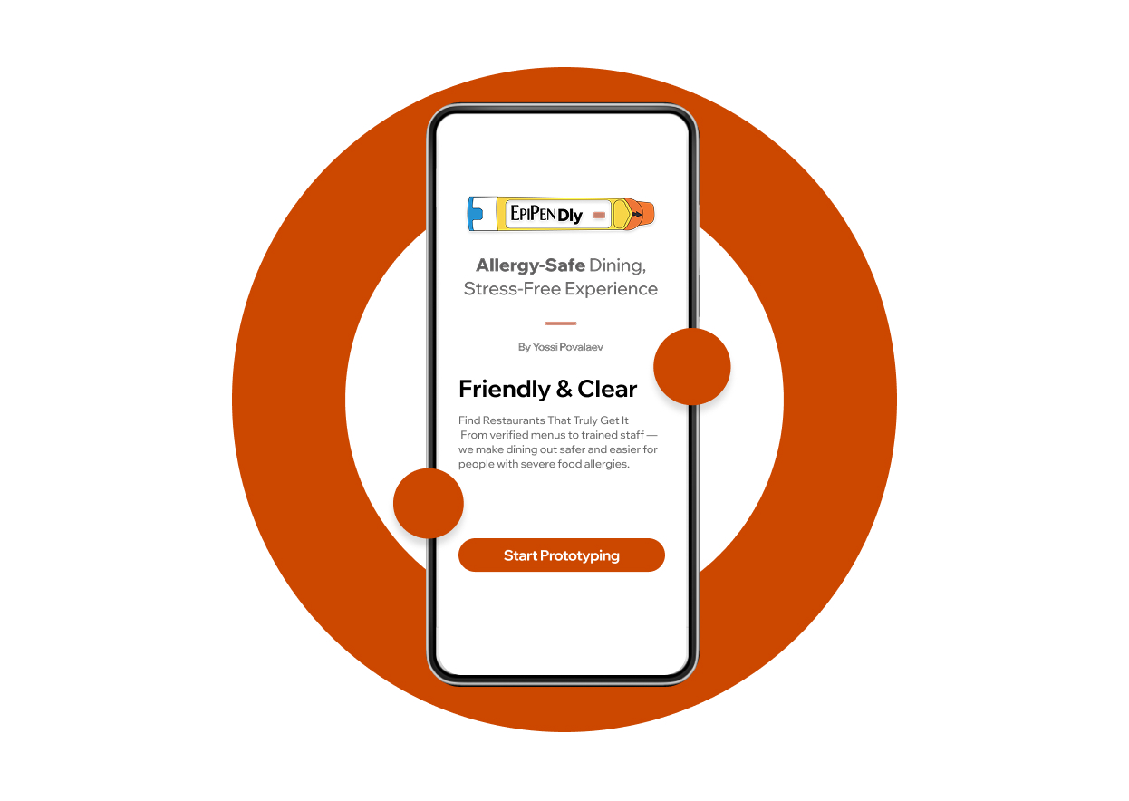
Allergy‑Safe Dining App for Confident Restaurant Discovery
Epipendly is a UX/UI case study focused on designing a safety‑first dining experience for people with severe food allergies. Through user research, usability testing, and iterative design, I created a mobile app that helps users confidently find EpiPen‑equipped, allergy‑aware restaurants.
Project Duration: Aug 2024 to Nov 2025
Project Overview
People with severe food allergies often feel unsafe dining out due to inconsistent allergy practices and a lack of emergency preparedness in restaurants. This uncertainty creates anxiety and can lead to serious health risks.
Project Overview
The goal of Epipendly is to help individuals with severe allergies easily find restaurants that are prepared to handle allergic reactions. By surfacing clear safety information, the app supports safer dining experiences and promotes greater awareness within the restaurant industry.
Project Overview
Lead UX Designer & UX Researcher. I led the end‑to‑end UX process, from research and problem definition to wireframing, prototyping, usability testing, and high‑fidelity design.
Project Overview
As Lead UX Designer and UX Researcher, I conducted user research, created personas, and mapped user journeys. I designed wireframes, prototypes, and high-fidelity mockups, ensuring the app was intuitive and accessible. I also conducted usability testing and collaborated with stakeholders to align the app with user needs and business goals.
Users were frustrated by staff members who were unprepared to handle allergic reactions.
Menus often lacked detailed allergen transparency.
Allergy procedures varied greatly between restaurants.
Users struggled to identify dining options they could trust.
Problem statement:
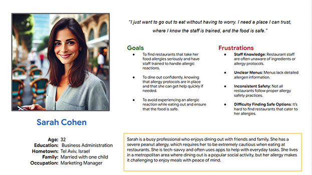
Sarah Cohen is a busy marketing manager with a severe peanut allergy. She wants to enjoy dining out socially without worrying about untrained staff or unsafe food handling.
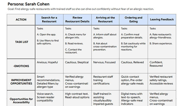
User Journey Map:
The user journey map outlines Sarah’s experience using Epipendly—from searching for a restaurant to reviewing safety details, communicating her needs, and leaving feedback. Mapping her emotions and actions revealed opportunities to reduce anxiety, improve safety visibility, and create a more intuitive experience.
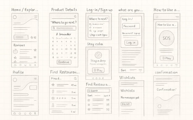
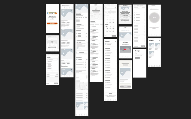
wireframe
The paper wireframes for the Epipendly app focus on clear content layout and intuitive navigation to support users with severe food allergies. They prioritize quick filtering, trusted restaurant visibility, and a reassuring user experience, while leaving room for future features like safety badges and emergency tools.
wireframe
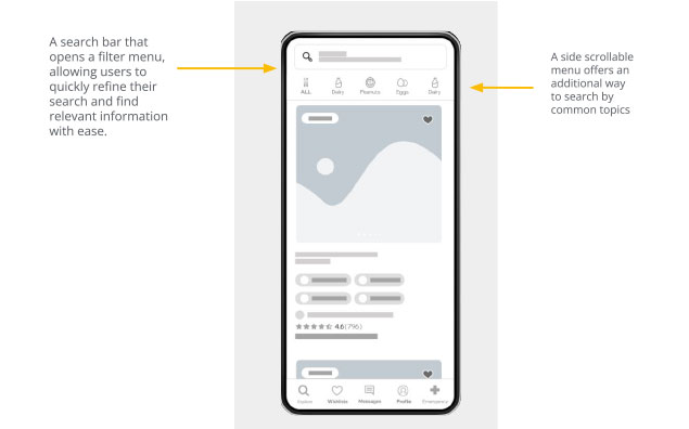
The digital wireframes were designed to match users’ expectations for quickly finding allergy-safe restaurants. The layout focuses on presenting key safety information clearly while minimizing the steps needed to explore dining options. A top search bar allows users to filter results by allergens and location, helping them find safe restaurants more efficiently. A side scrollable menu offers an additional way to browse by common allergen categories, improving navigation and accessibility.
wireframe
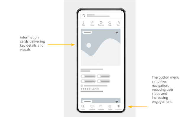
The information cards were designed to be space-efficient, presenting key restaurant safety details and visuals in a clear, easy-to-scan format. Each card highlights essential elements such as allergen notes, staff training indicators, and EpiPen availability. Additional features include a wishlist button for saving safe restaurants and clear labels for important safety markers. The bottom navigation menu simplifies movement through the app, reducing steps and improving overall usability.
Prototype
The low‑fidelity prototype maps the core flow of finding an allergy‑safe restaurant. Users search or apply filters, review key safety details, explore menus or reviews, and access emergency tools for reassurance.
Two rounds of usability testing were conducted to evaluate navigation, filtering behavior, and profile management. Findings informed improvements to visual hierarchy, clarity, and information organization.
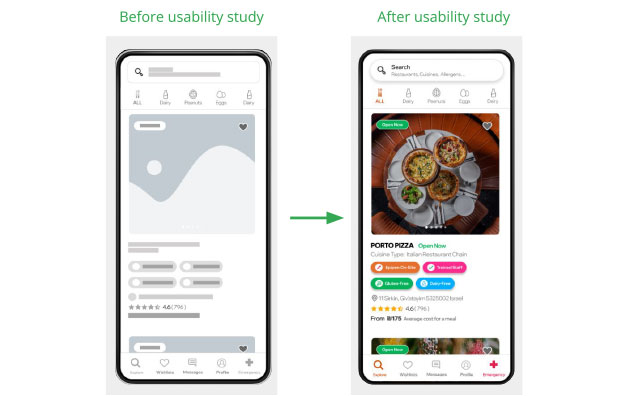
Mockups
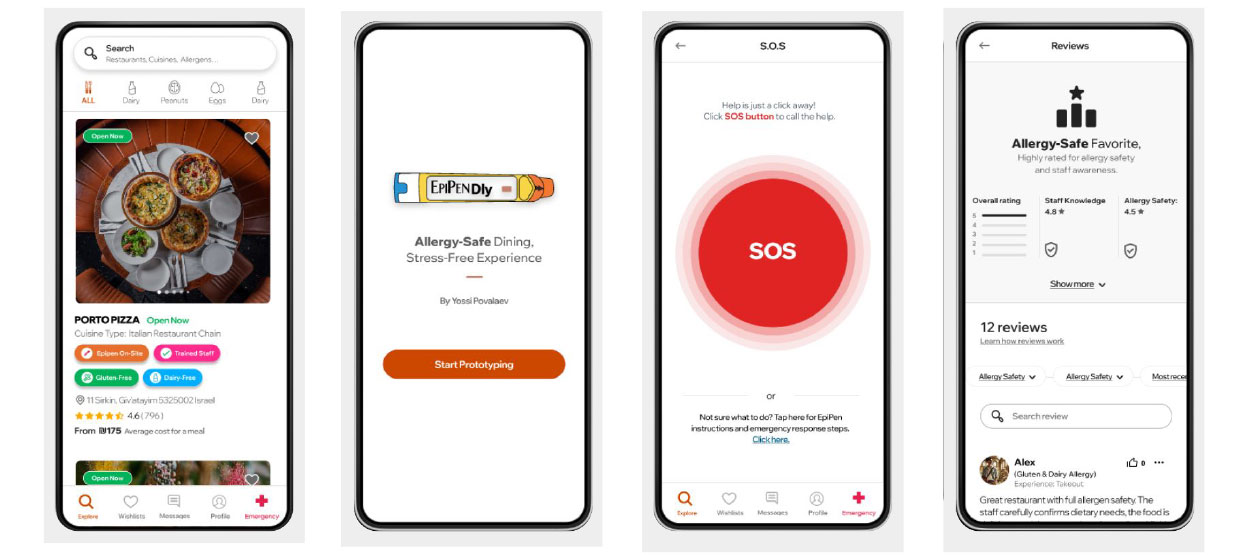
Clear allergen indicators, EpiPen availability, restaurant imagery, and user reviews were surfaced early to help users assess safety at a glance. This reduced uncertainty and supported faster, more confident decisions.
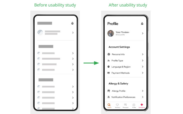
Mockups
Usability testing revealed confusion around profile settings. The profile screen was reorganized into clearly labeled sections, separating account settings from allergy and safety information. This improved discoverability and reduced cognitive load.
Prototype
A high‑fidelity prototype was created to demonstrate the refined flows, visual hierarchy, and safety‑first design approach.
link to prototype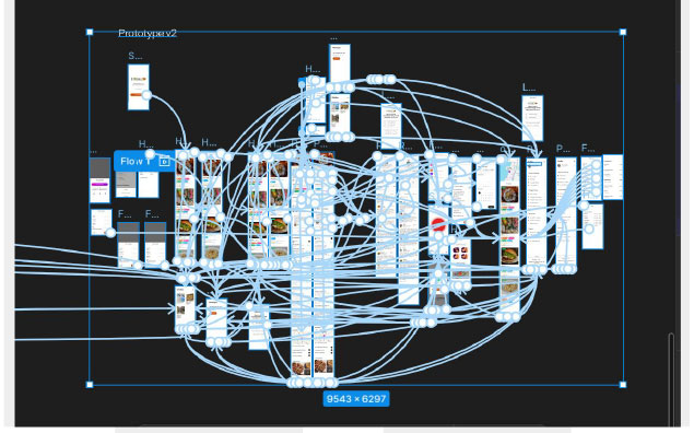
Usability improvements helped users feel more confident and less anxious when navigating safety-critical information. One participant noted that the app “felt trustworthy and clearly designed for people with allergies.”
Designing for safety requires prioritizing emotional reassurance alongside usability. Clear hierarchy, labeling, and feedback are essential in reducing anxiety in high‑risk situations.
Continue testing with a broader range of allergy sufferers and restaurant staff to refine edge cases.
Improve performance, speed, and touch interactions for real‑world, on‑the‑go use.
Introduce tailored recommendations based on allergy profiles and user preferences.